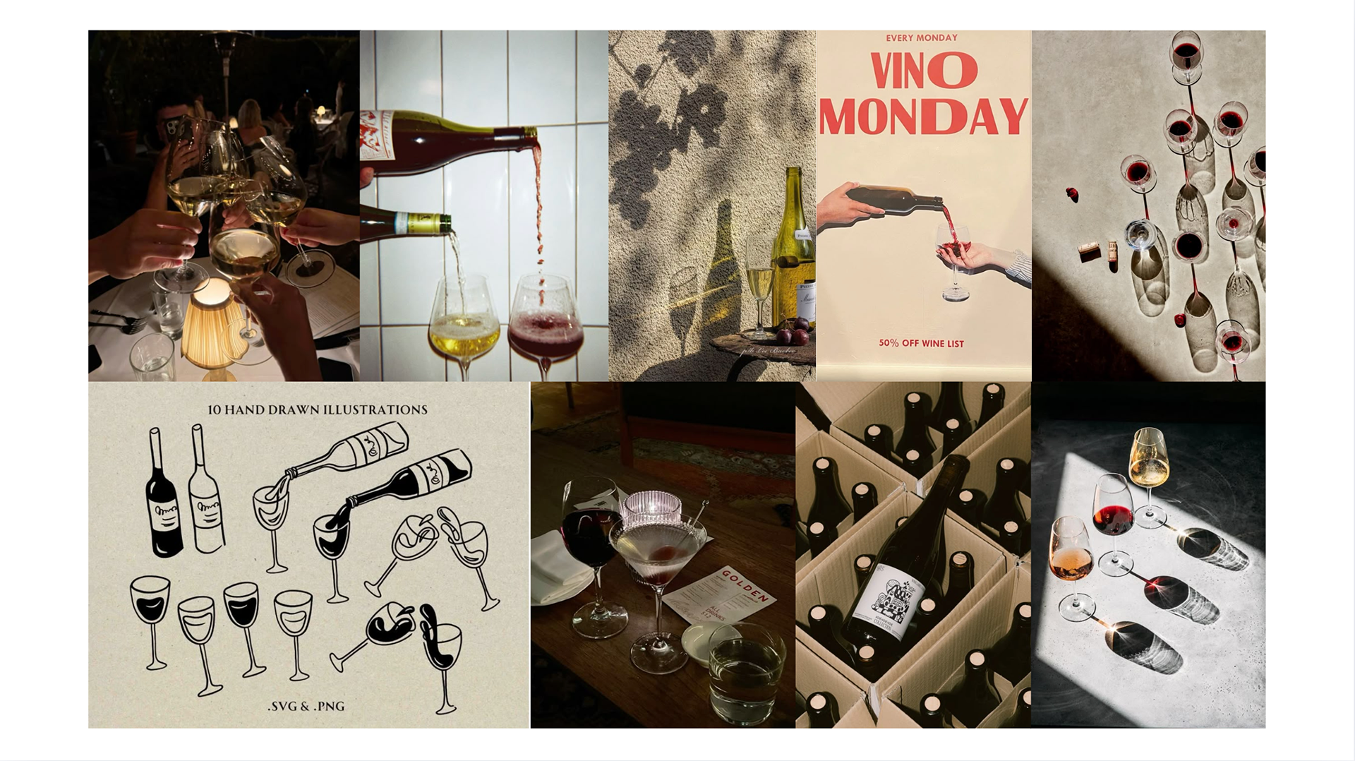
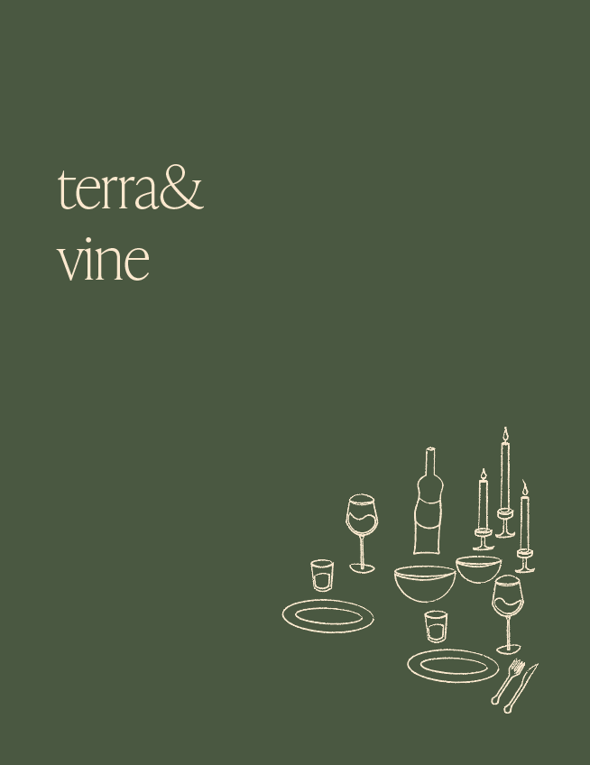
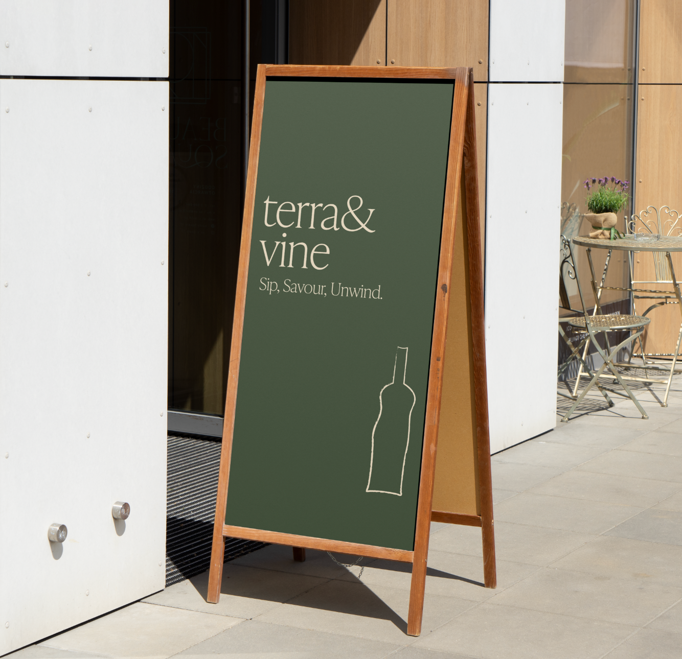
Terra & Vine blends timeless sophistication with approachable elegance. The brand is rooted in the idea of slow dining—an invitation to sip, savour, and unwind. The visual identity and menu design reflect a modern take on the classic European wine bar with a touch of artistic charm.
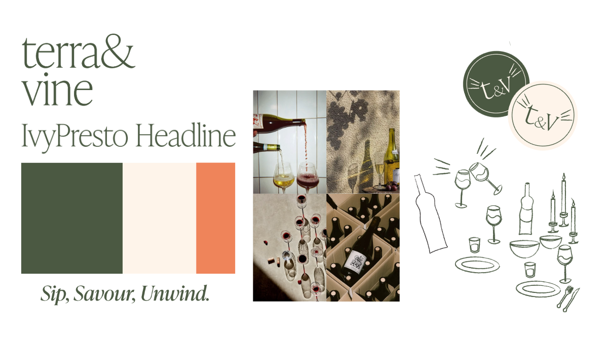
ELEGANT | ROMANTIC | GROUNDED | WELCOMING
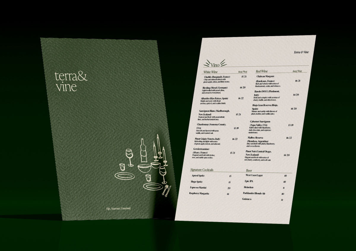

Typography:
The serif logotype communicates refinement and tradition, while the use of ampersand (&) adds a sense of intimacy and partnership—perfect for a dining experience built on connection and pairing.
Layout & Hierarchy:
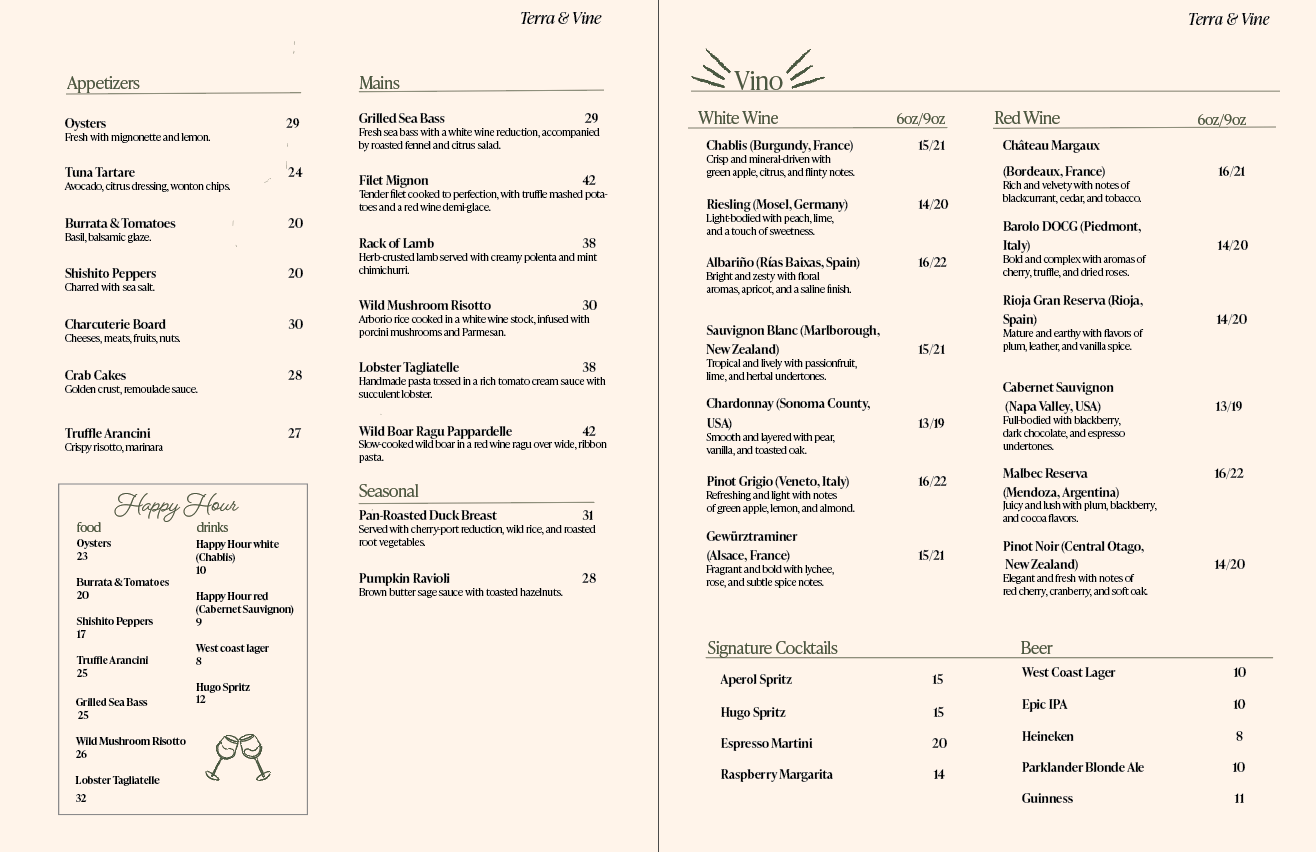
Clean, minimalist spacing and clear alignment create an easy-to-navigate structure. Wine and appetizer sections are well organized, with pricing subtly tucked in for clarity. Use of italics and type scale enhances readability while maintaining an upscale aesthetic.
Graphic Elements:
Delicate line drawings of wine glasses, candles, plates, and cutlery add charm and storytelling without overpowering the content. These hand-drawn elements humanize the design, suggesting thoughtful, intimate dining.
Target Audience:
Young professionals and wine lovers aged 25–45 who value ambiance, great design, and curated culinary experiences. Ideal for date nights, celebrations, or relaxed, elevated evenings out.
MENU FLATS

This project was completed in Adobe Indesign, Illustrator and Photoshop