UI/UX
Zara Design Study is a personal redesign project that reimagines the fast-fashion brand’s website with a focus on clarity, ease of use, and refined visual balance. The goal was to create a more intuitive and enjoyable shopping experience across all devices, while staying true to Zara’s editorial, fashion-forward identity.
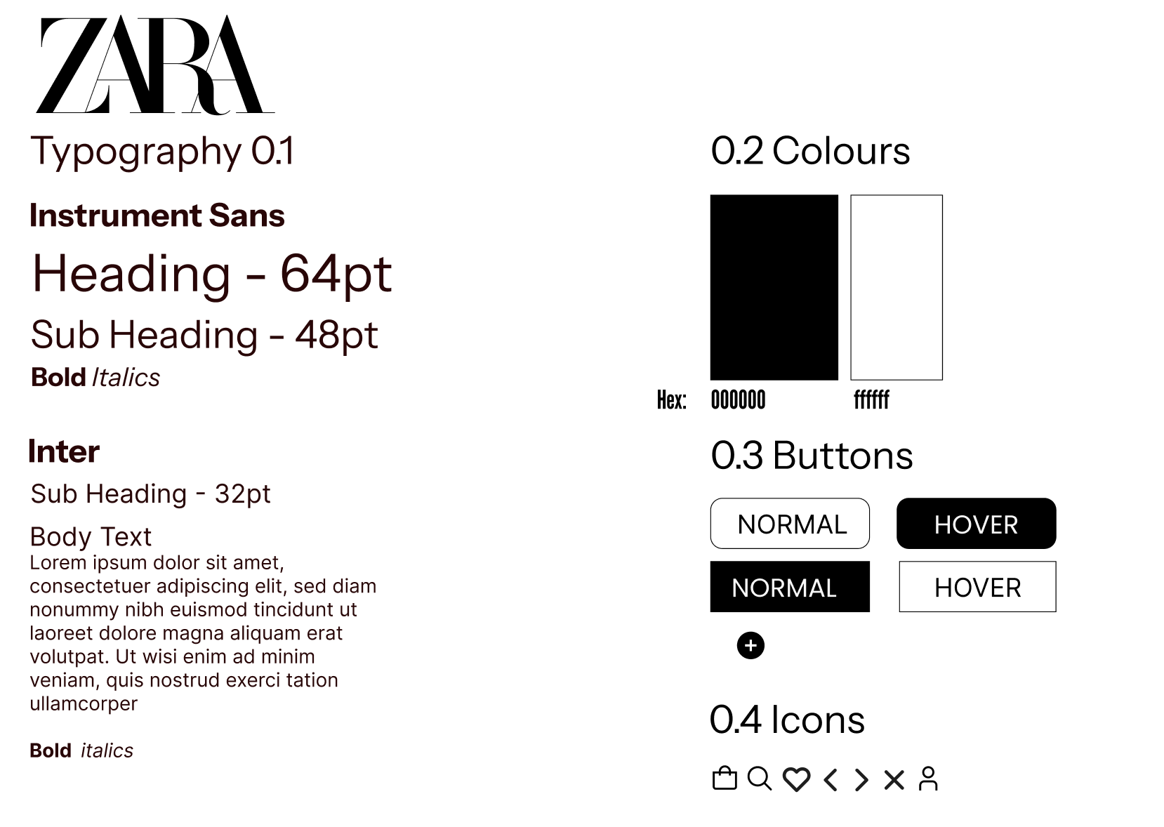
The redesign simplifies the interface by reducing clutter and introducing more negative space, allowing products and visuals to take center stage. Navigation is streamlined with a clearer structure and improved filtering, making it easier for users to browse and discover items efficiently. On mobile, layouts are optimized for touch, ensuring smoother navigation and better responsiveness. A stronger visual hierarchy—achieved through consistent typography and layout—guides users naturally through the site, blending editorial storytelling with functional e-commerce design.
https://www.figma.com/design/Y6VNCZxCIb0MUV10UgALr5/Untitled?node-id=2-3&t=dG0O3Zp2dxifRKyC-0
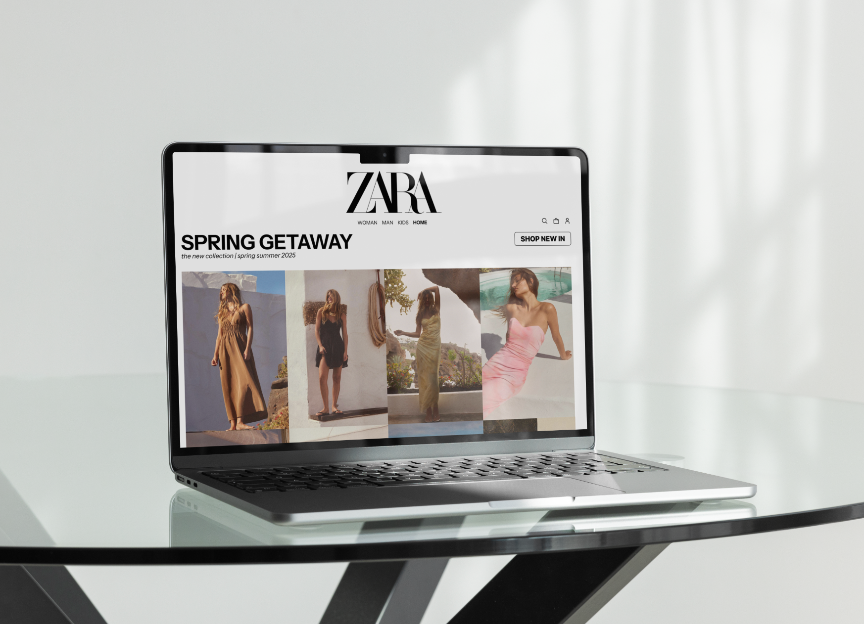
New Home Page
Original Home Page

New Product Page
Original Product Page
Key Insights
Decluttered Interface
Simplified layouts and increased white space reduce visual noise, letting products stand out and improving overall readability.
Simplified layouts and increased white space reduce visual noise, letting products stand out and improving overall readability.
Streamlined Navigation
A clearer menu structure and intuitive filters make it easier for users to browse and find items quickly.
A clearer menu structure and intuitive filters make it easier for users to browse and find items quickly.
Mobile-Friendly Design
Enhanced mobile layouts with thumb-friendly navigation and smoother scrolling create a more seamless experience on smaller screens.
Enhanced mobile layouts with thumb-friendly navigation and smoother scrolling create a more seamless experience on smaller screens.
Stronger Visual Hierarchy
Improved typography and spacing guide users naturally through content, making the shopping journey more intuitive.
Improved typography and spacing guide users naturally through content, making the shopping journey more intuitive.
Balanced Brand Expression
The redesign maintains Zara’s editorial feel while prioritizing function, blending style with a smoother e-commerce experience.
The redesign maintains Zara’s editorial feel while prioritizing function, blending style with a smoother e-commerce experience.
Home Mobile
Shop Mobile

Style Guide