For the Cherry Bomb Music Festival I created a bold, energetic brand identity that celebrates pop culture, girl power, and musical icons. The design was inspired by the festival’s mission to empower women, promote inclusivity, and encourage self-expression. I created a vibrant visual identity filled with sparkle, colour, and pop flair—designed to capture the spirit of iconic performers like Taylor Swift and Lana Del Rey, as well as emerging voices like Chappell Roan and Gracie Abrams. Every detail from the logo to the promotional materials was crafted to celebrate the artists shaping today’s pop scene and inspire the next generation of fans.
EMPOWERMENT | PLAYFUL | ICONIC | BOLD
MOODBOARD

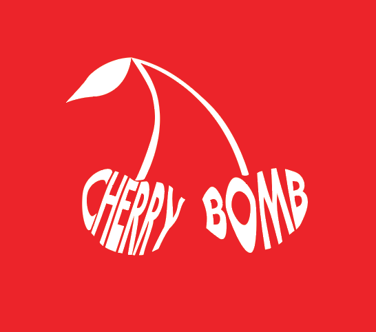
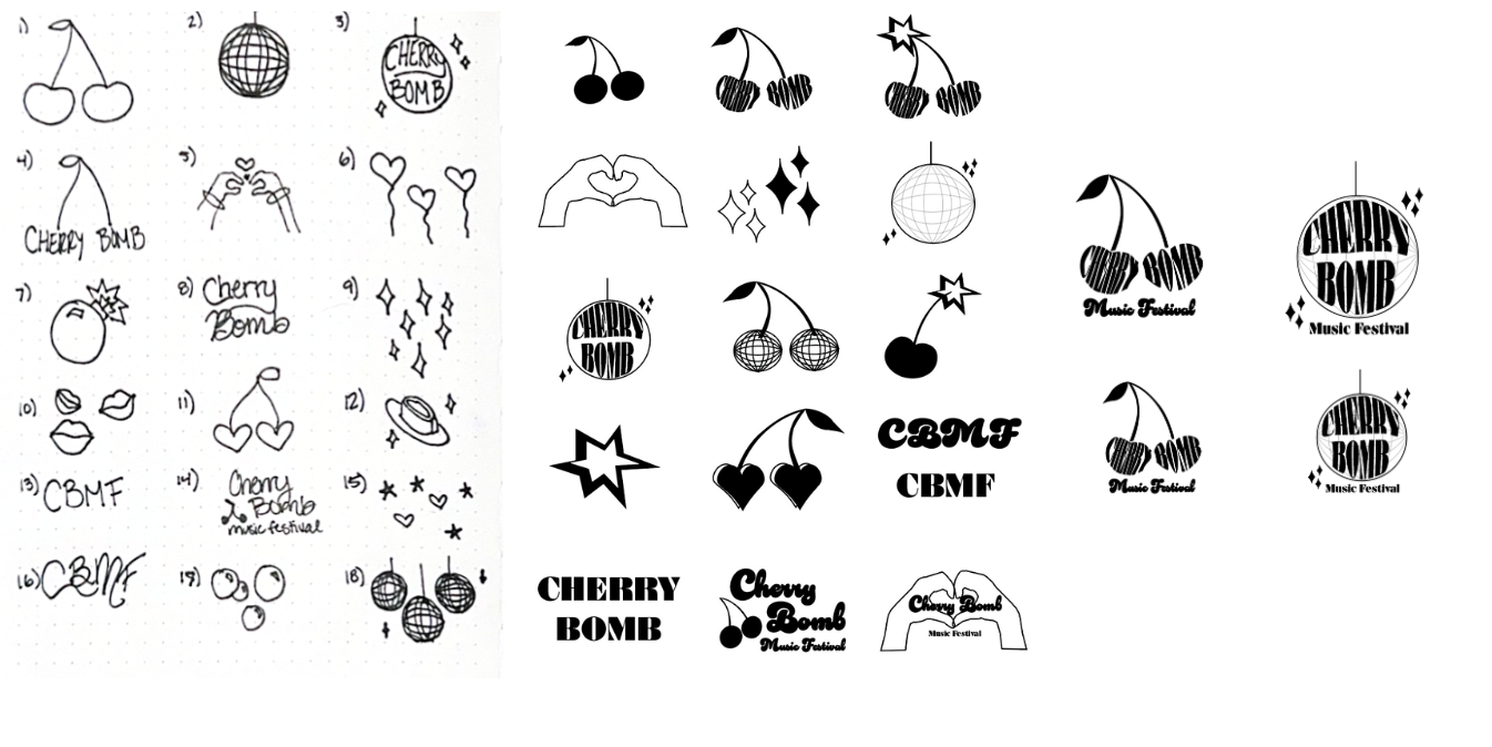
LOGO
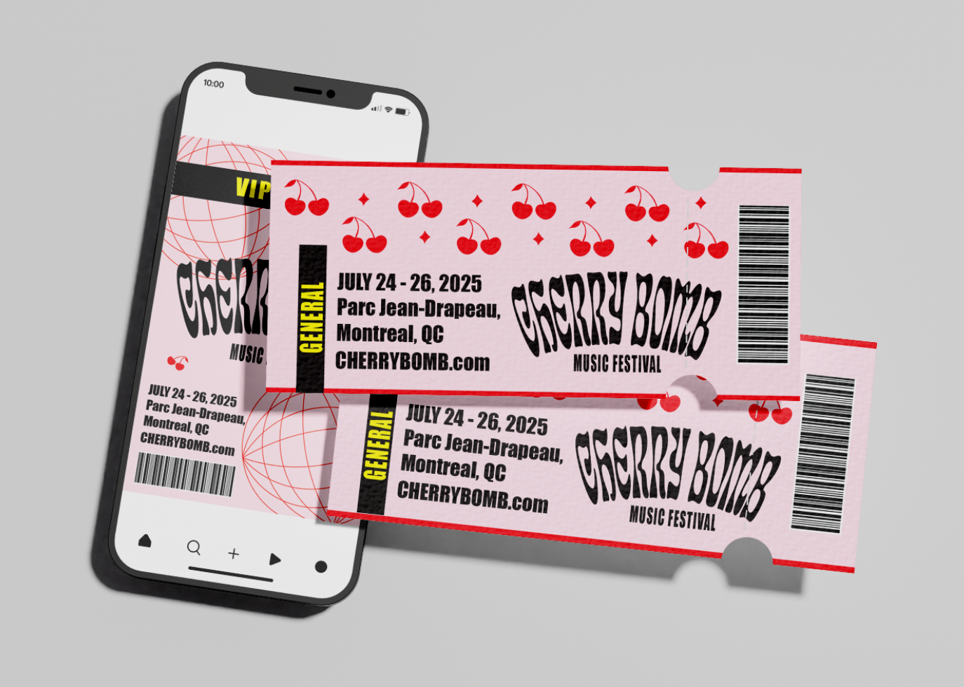
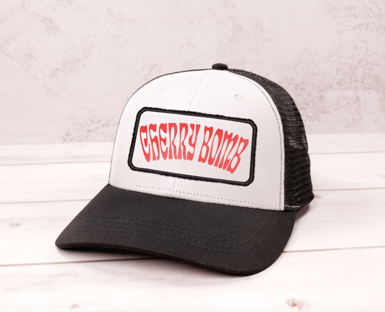
I designed the Cherry Bomb logo to reflect the bold, high-energy spirit of a pop music festival that celebrates women and empowerment. I used the shape of two cherries as the foundation, and warped the text “CHERRY” and “BOMB” to fit inside each one. The custom lettering plays off the natural curves of the fruit, creating a sense of rhythm and motion that feels playful and dynamic—just like pop music.
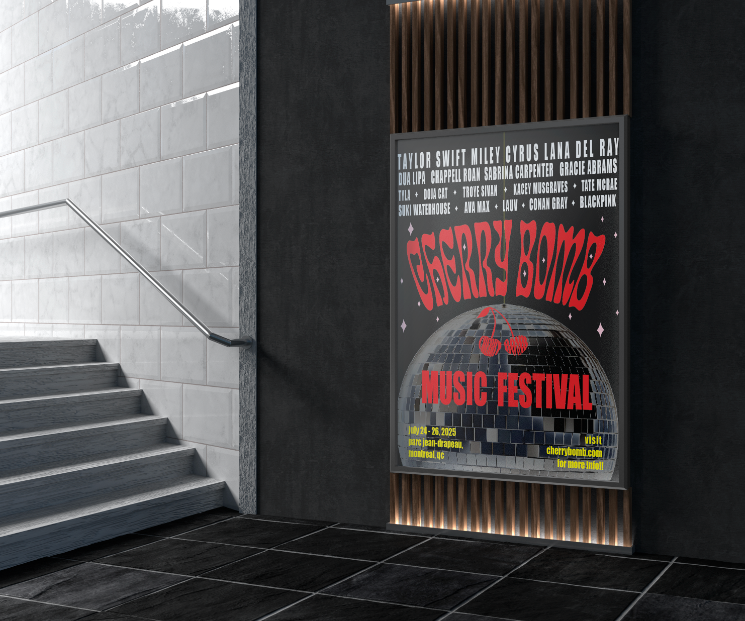
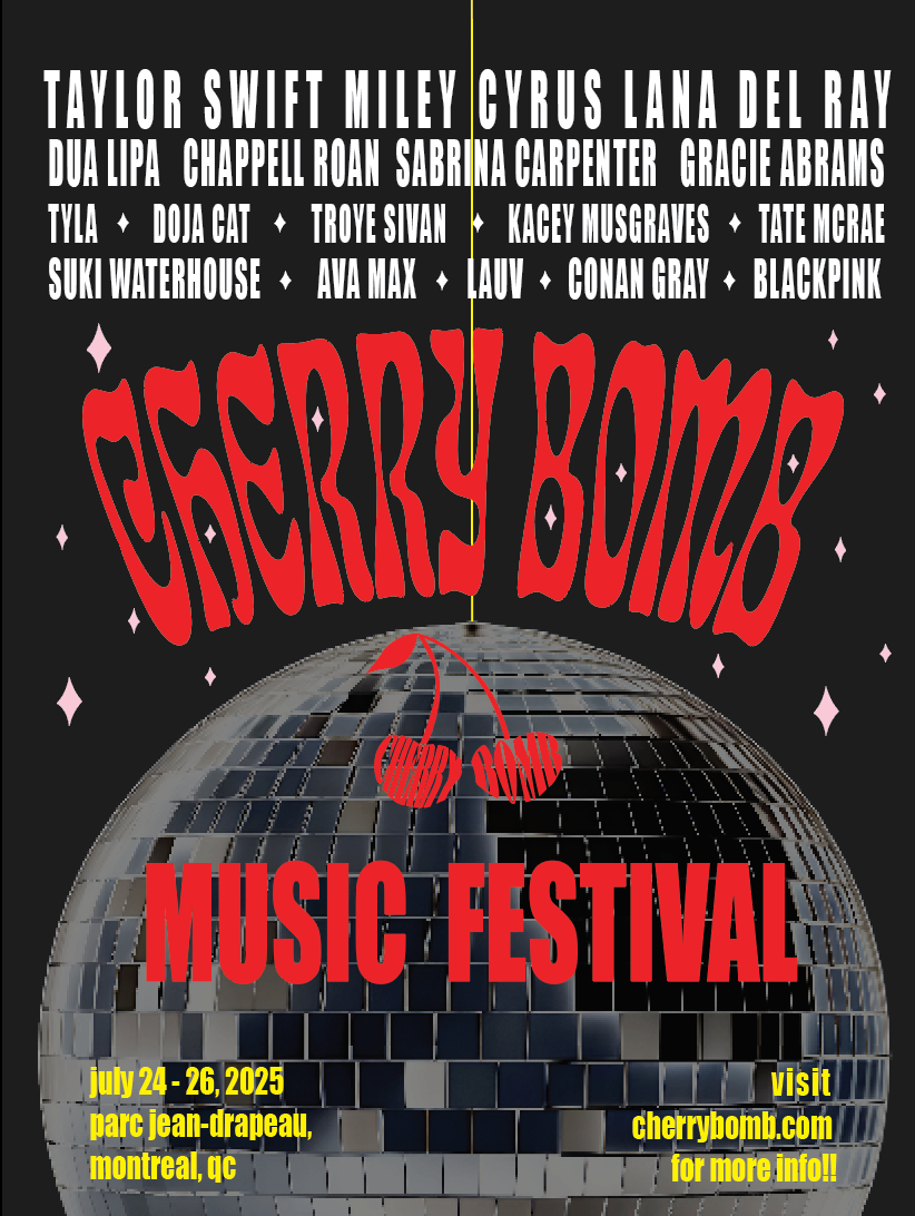
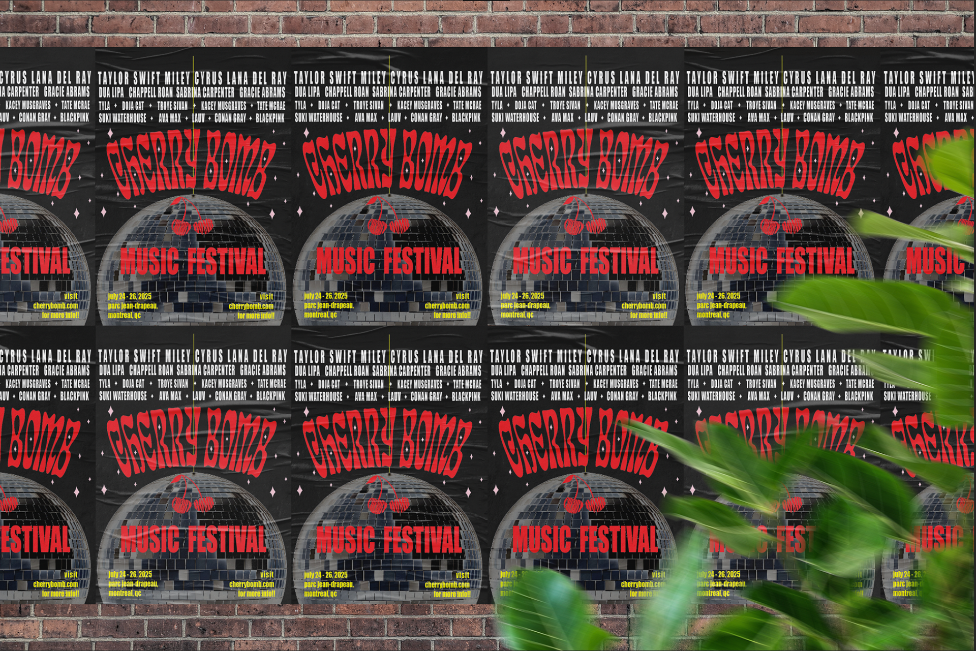
Festival Poster
Colour Palette
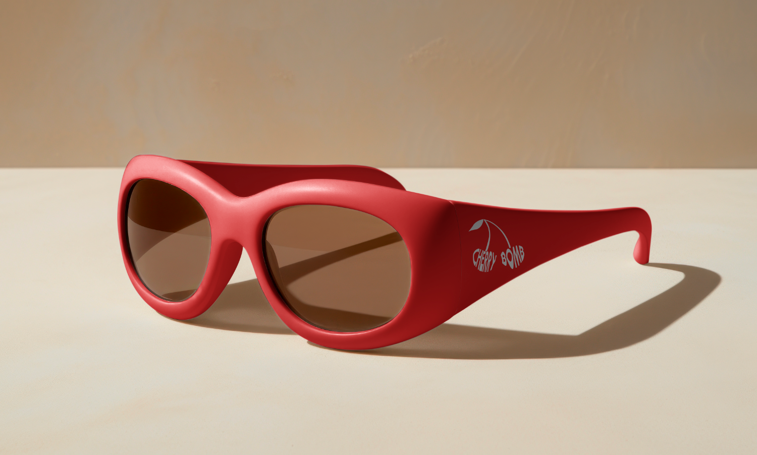
Cherry Red: Bold, energetic, and instantly eye-catching. Red evokes passion, power, and rebellion—perfect for a festival rooted in pop culture energy and empowerment.
Black: Adds a moody, nighttime vibe that contrasts and amplifies the boldness of red. Think: late-night glamour and underground energy.
Silver Chrome: Reflective and dynamic, the mirrored disco ball texture nods to classic dance floors and 2000s nostalgia, enhancing the playful and modern/y2k aesthetic.
Soft Pink & Yellow (e.g., seen in the stars and information): Feminine and fun, they soften the boldness of the primary palette.
Tickets Sunglasses
Typography
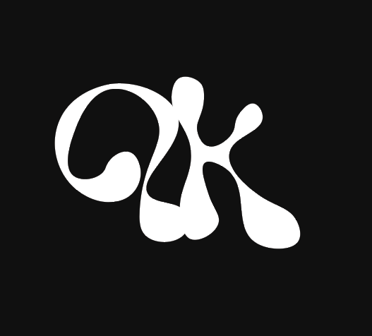
Primary Typeface – Eckmannpsyhc: The warped, oversized “CHERRY BOMB” logo font exudes personality. It’s campy, playful, and confident, capturing the unapologetic attitude of pop music and its performers.
Secondary Typeface – Impact: Clean and punchy for the lineup and event details. High legibility paired with high impact—ideal for posters and digital screens.
Graphic Elements
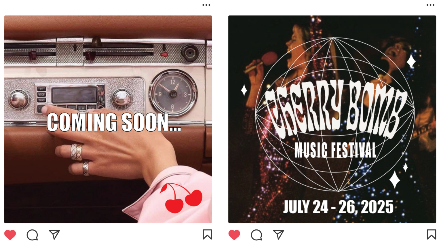
Disco Ball Iconography: A central visual metaphor—symbolizing dance, celebration, and classic pop culture. It’s both nostalgic and iconic.
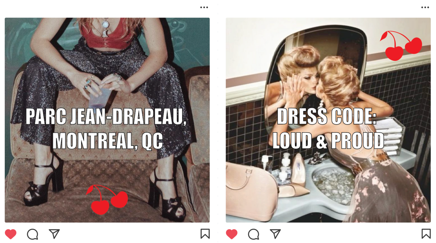
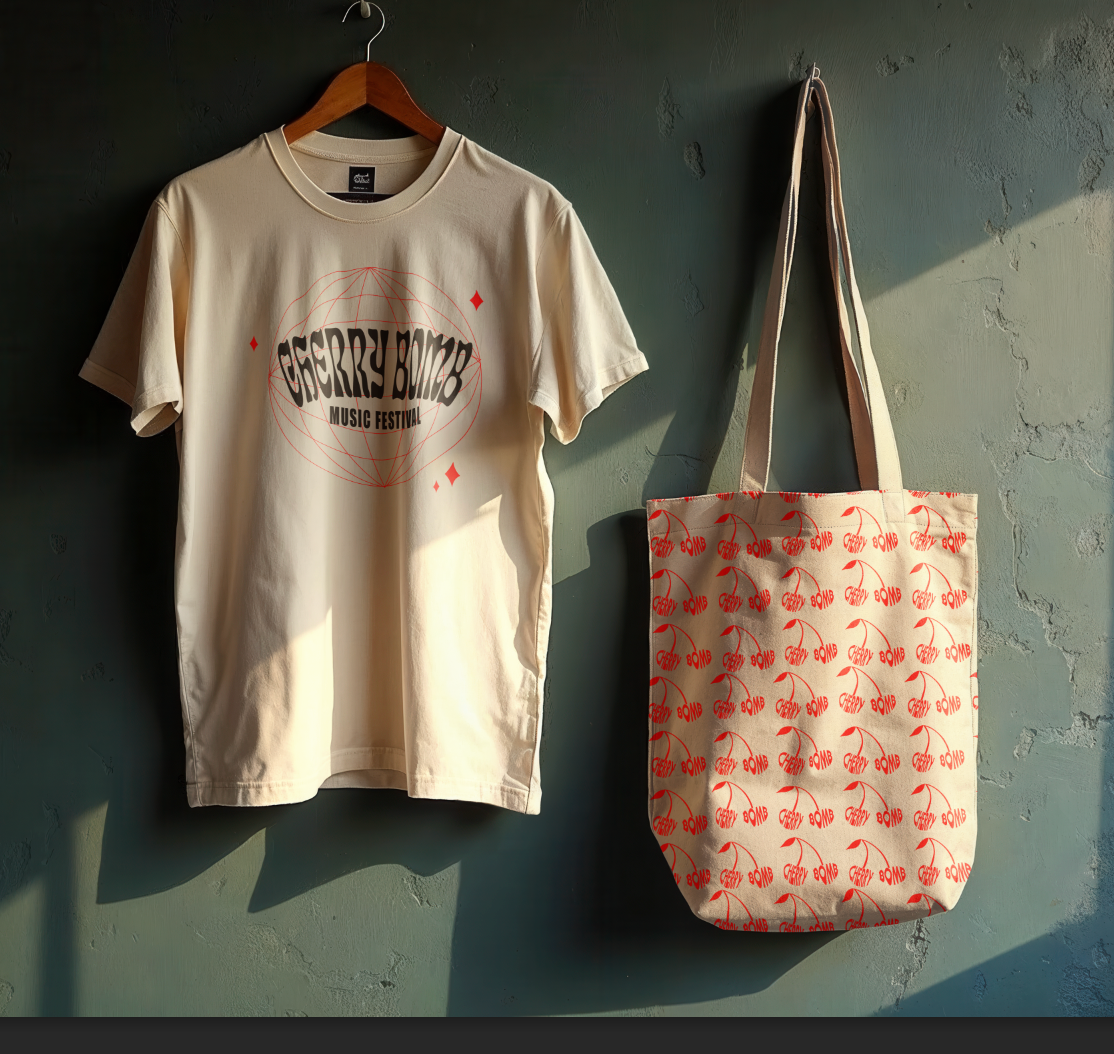
Cherry Motif: A flirty, feminine visual that ties directly to the name and adds a playful wink to the identity. It gives the brand a cheeky personality.
Sparkles & Stars: Add movement and visual rhythm. These small whimsical touches enhance the magical, dream-like tone of the festival experience.
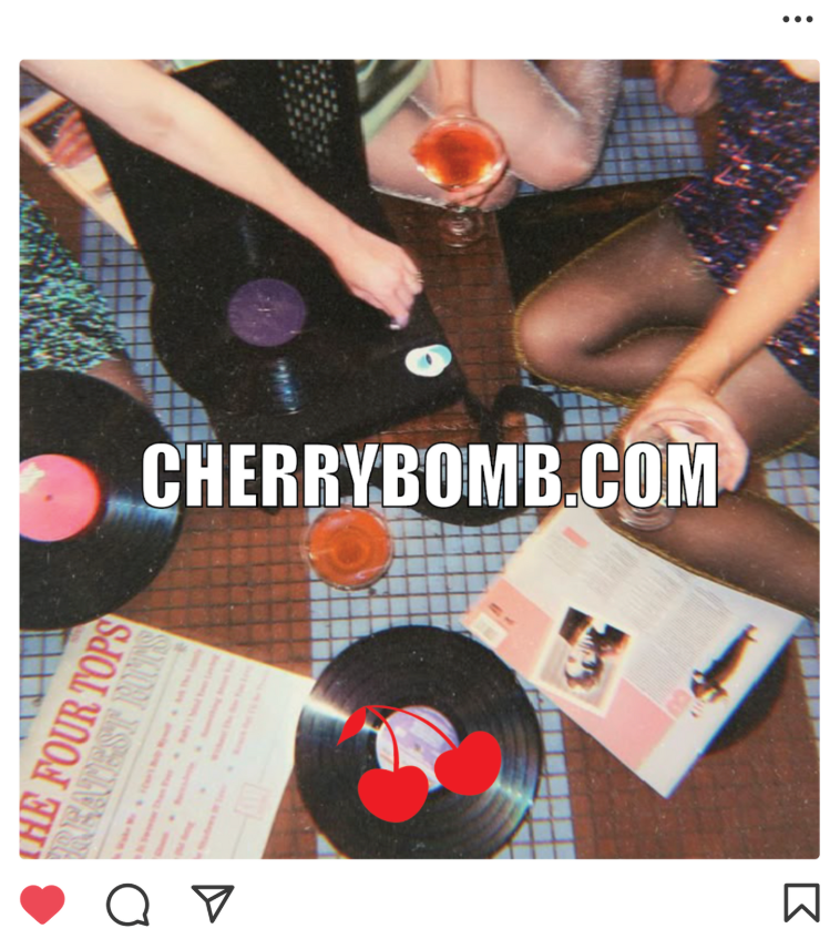
PROMOTIONAL INSTAGRAM POSTS
Target Audience
Primary: Gen Z and Millennial women (ages 16–35) who live and breathe pop music, from iconic queens like Miley Cyrus and Taylor Swift to new-gen favs like Olivia Rodrigo and Chappell Roan.
Secondary: Queer communities and pop culture super fans who resonate with themes of empowerment, camp, and emotional connection through music.
Merch
This project was completed in Adobe Illustrator and Photoshop